Lamborghini changes logo after 20 years
Lamborghini has changed its logo after two decades as part of a rebranding strategy that “embodies (its) new trajectory focused on sustainability and decarbonisation” outlined by its Direzione Cor Tauri program.
The Italian brand said: ”The aim is to create a solid pact with the future generations, serving as an inspiration and model for innovation and sustainable progress. With this in mind, the House of Sant’Agata Bolognese is implementing changes that involve not only the cars, but the corporate identity as a whole, thus impacting the company’s culture and values, which will also see a new expression in terms of all the visual aspects.”
Lamborghini’s previous logo
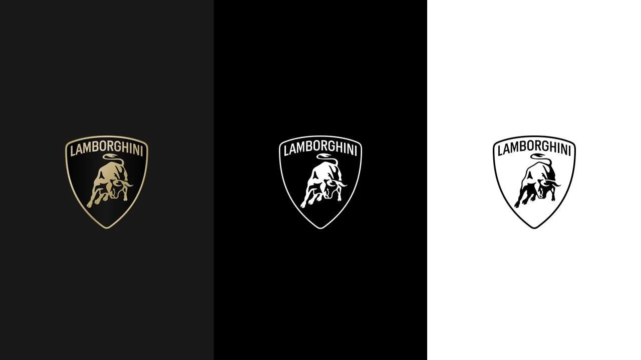
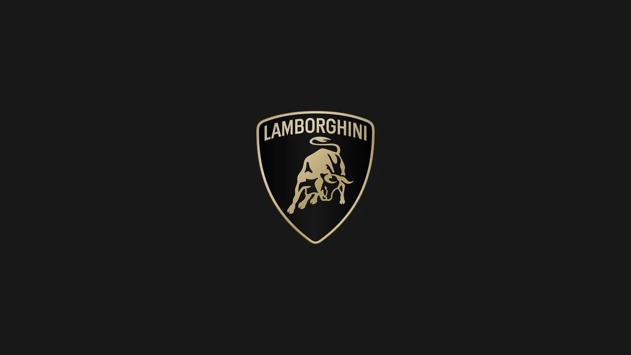
While the new logo is the same on the surface, it has been simplified with a silhouette of its famous bull and a more 2D look. The gold colour used on the previous logo has now switched to a subtle bronze and the Lamborghini lettering has been replaced with a “broader typeface”. It will be used on all the company’s official channels and cars going forward.
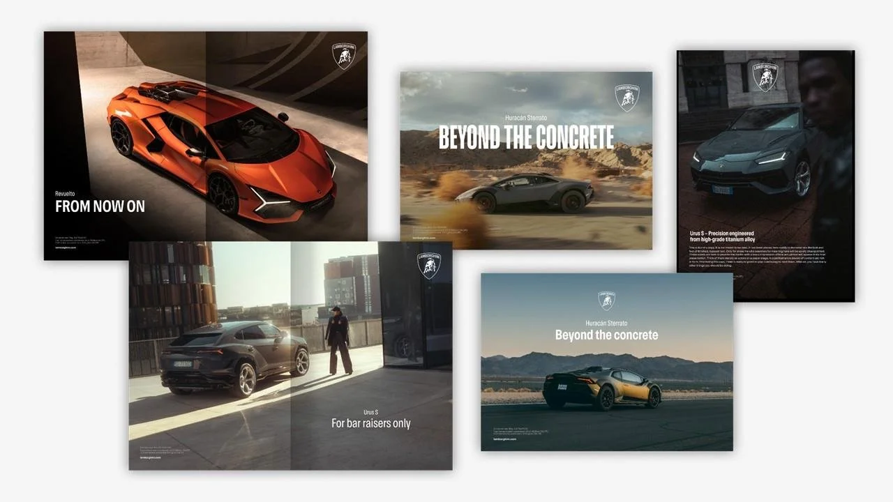
Lamborghini also says the famous bull will “exist individually on the company’s digital touchpoints, separated from the classic shield to lend it even greater prominence.”
While we can expect to see the new badge make its first appearance on the soon-to-be-revealed hybrid Urus and Huracan successor, the Direzione Cor Tauri outlines Lamborghini’s plan to introduce its first EV (by 2028) and electrify its lineup with vehicles that match its vision.


words: Mike Booth
pictures: Lamborghini


